
What PM2.5 Numbers Actually Mean, From Air Quality Readings to Health Risk
By MHB Admin ·

Air-quality apps, weather forecasts and news reports now routinely give a number for fine particulate matter, usually written as PM2.5. A city might report an annual average of 9 micrograms per cubic metre. A wildfire might push readings past 200. A regulator might set a limit of 9, while the World Health Organization recommends 5, and the European Union is moving from 25 to 10.
These numbers are measured carefully and backed by some of the largest health studies ever conducted. They are also widely misunderstood. A PM2.5 figure can describe a one-hour reading, a 24-hour average or a year-long average, and the health evidence differs for each. A legal limit is not a line below which air is harmless. And the figures that connect PM2.5 to deaths and disease come from population studies, which describe risk across millions of people rather than for any individual.
This article explains what PM2.5 is, how it is measured, how scientists link it to health, what the limits in different countries mean, and how to read the numbers you see.
What is being measured
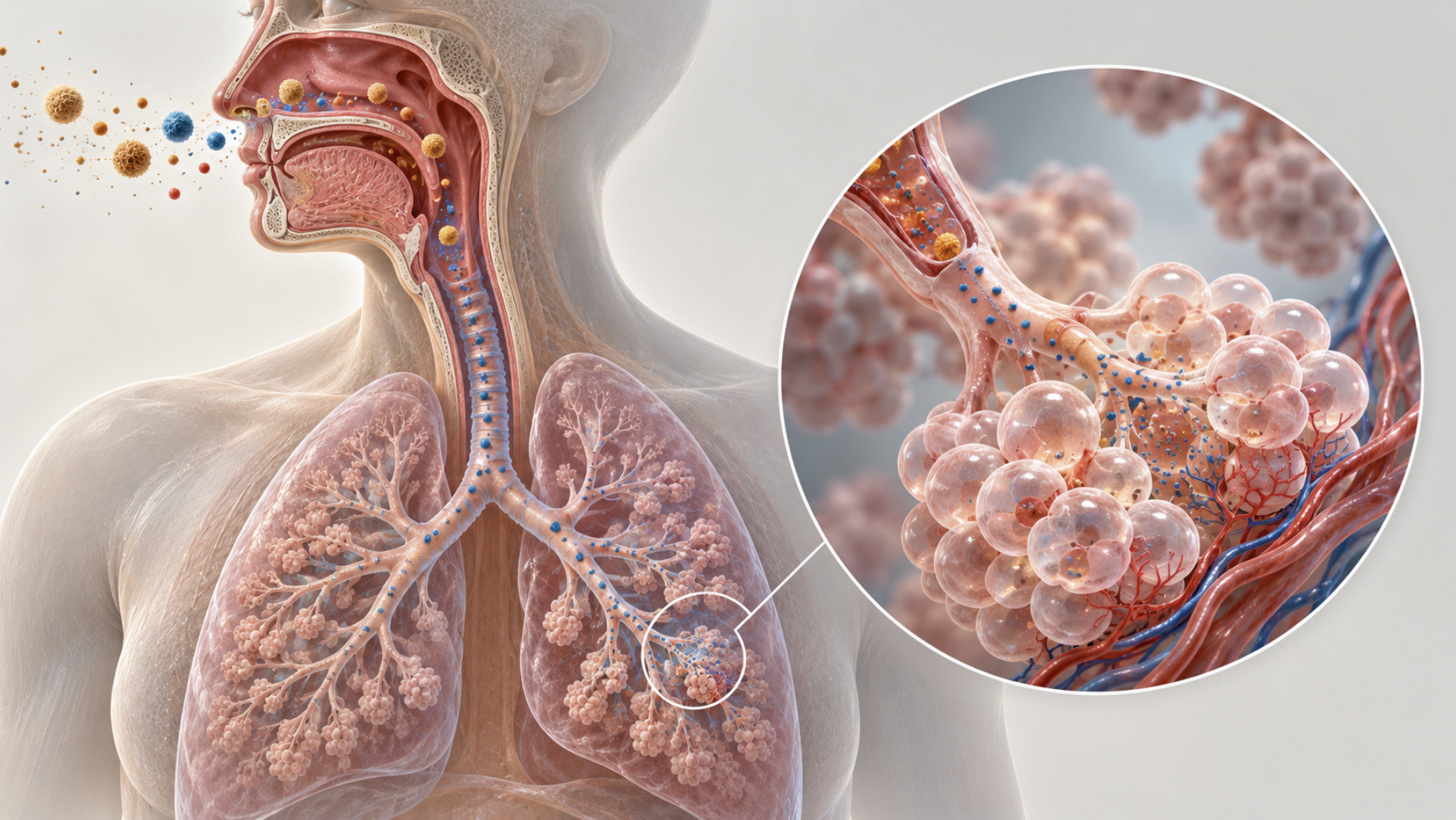
PM2.5 refers to particles in the air with a diameter of 2.5 micrometres or less. For comparison, a human hair is typically about 50 to 70 micrometres across. Particles this small can be inhaled deep into the lungs, and the smallest fractions can reach the bloodstream.
PM2.5 is not a single substance. It is a mass measurement: the total weight of fine particles in a given volume of air, expressed in micrograms per cubic metre (µg/m³). Those particles come from many sources and have different chemical makeups. They include soot from vehicles and power generation, smoke from wildfires and wood burning, sulfates and nitrates formed in the air from gases emitted by industry and traffic, dust, and particles formed from agricultural ammonia. Two locations with the same PM2.5 reading may be breathing quite different mixtures.
That matters because the health evidence is built mainly on mass. Researchers are still working out whether some sources, such as combustion or wildfire smoke, are more harmful per microgram than others. For now, regulators treat PM2.5 mass as the main measure of exposure, while acknowledging that composition may also matter.
Why the averaging period changes everything
The same pollutant is measured and regulated over different time periods, and they tell you different things.
Short-term readings, such as hourly values or 24-hour averages, capture episodes: a smoky day, a winter inversion, a traffic peak. Air-quality apps typically show these, often converted into an index rather than raw concentrations.
Annual averages capture long-term exposure. A city's annual average combines clean days and polluted days into one figure.
The health evidence for the two differs. Short-term spikes are associated with increases in hospital admissions and deaths in the following days, particularly among people with existing heart and lung disease. Long-term exposure is associated with larger and more lasting effects, including higher rates of cardiovascular disease, lung cancer and death from all causes. Most of the estimated burden of disease from PM2.5 comes from long-term exposure, not from occasional spikes.
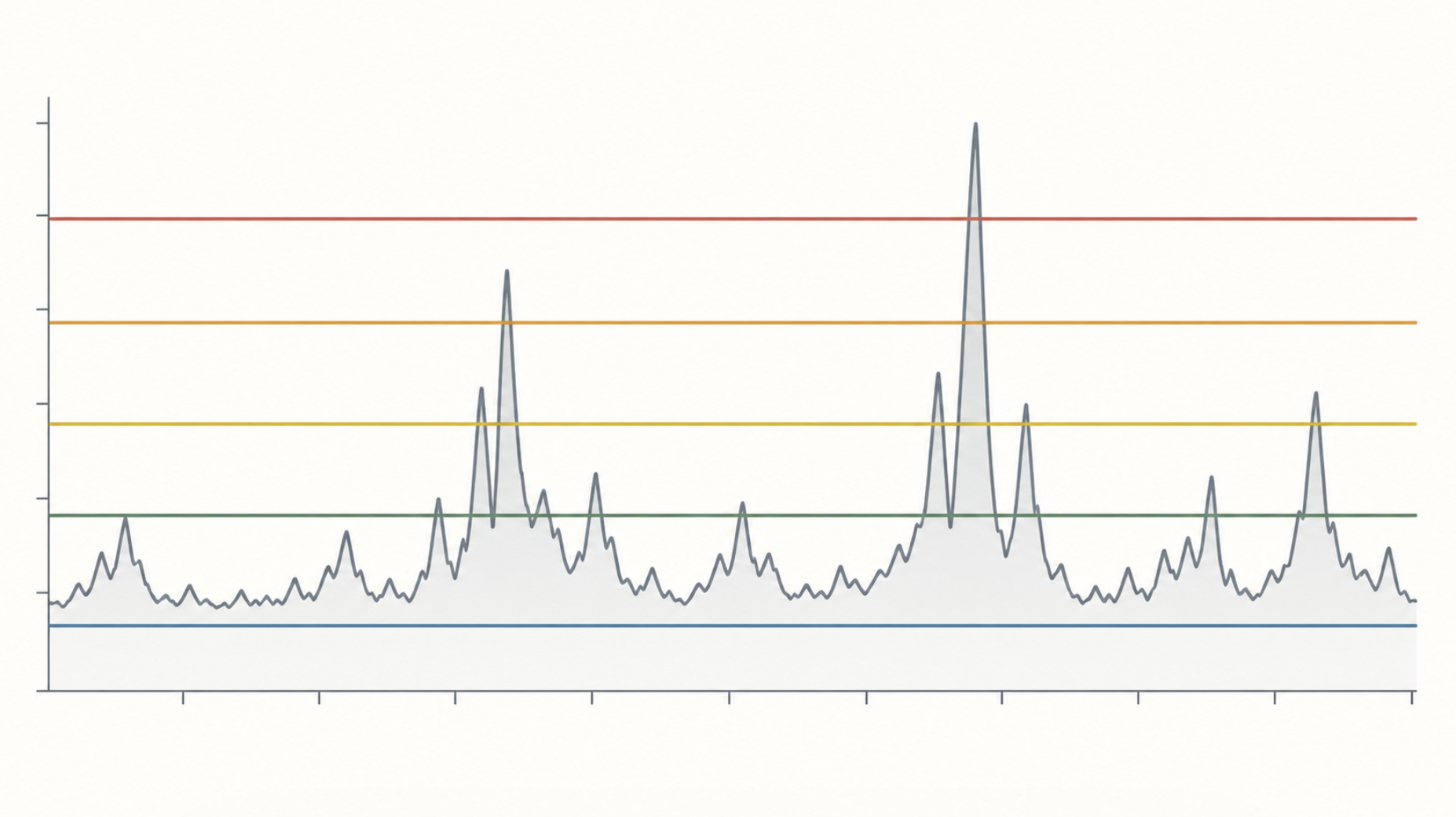
So a city with an annual average of 8 µg/m³ is not one where the air is always at 8. It may have many days at 3 and a few at 40. And a single day at 40 does not have the same health meaning as an annual average of 40.
How scientists connect PM2.5 to health
The evidence linking PM2.5 to illness and death comes from several kinds of research, each with different strengths.
Cohort studies follow large groups of people for years, estimate each person's long-term exposure, usually from where they live, and compare health outcomes. The first landmark studies date from the 1990s. The Harvard Six Cities Study, published in 1993, compared residents of six US cities and found that death rates were higher in cities with more fine-particle pollution, after accounting for smoking and other factors. Many larger studies followed.
One of the largest, published in the New England Journal of Medicine in 2017 by Qian Di and colleagues, examined about 61 million US Medicare beneficiaries over 2000 to 2012. It found that higher long-term PM2.5 exposure was associated with higher mortality. The association remained at concentrations below the US annual standard in force at the time, 12 µg/m³.
Meta-analyses combine results from many cohorts. For the WHO's 2021 air quality guidelines, Jie Chen and Gerard Hoek conducted a systematic review of long-term PM2.5 exposure and mortality. They estimated that each increase of 10 µg/m³ in long-term exposure was associated with an 8% higher risk of death from natural causes, with a 95% confidence interval of 6% to 9%.
Natural experiments examine what happens when pollution changes for reasons unrelated to the health of the people exposed. A 2009 study in the New England Journal of Medicine by Arden Pope, Majid Ezzati and Douglas Dockery examined 51 US metropolitan areas between the late 1970s and early 2000s. Areas where fine-particle pollution fell more saw larger gains in life expectancy. A decrease of 10 µg/m³ was associated with an increase in life expectancy of about 0.61 years, after accounting for changes in income, smoking and other factors.
Mechanistic research in laboratory and human exposure studies has identified ways fine particles can affect the body. These include inflammation in the lungs and blood vessels, changes in blood pressure and heart rhythm, and effects on blood clotting. That research makes the population associations biologically plausible.
From association to cause
Most of this evidence is observational. People are not randomly assigned to breathe polluted air, so an association between PM2.5 and death could in principle be explained by something else.
The main concern is confounding. People living in more polluted areas may differ in income, smoking, diet, occupation or access to health care, and those differences can affect health. Large studies adjust for these factors where they can, but some confounding may remain. Exposure misclassification is another issue. Most studies estimate exposure from outdoor concentrations near a person's home, but people spend much of their time indoors, at work or travelling, and individual exposure varies.
Researchers have tested these concerns in several ways. Associations persist across studies in many countries, with different populations and confounders. Higher exposures are associated with higher risks in a consistent dose-response pattern. Natural experiments, in which pollution changed for reasons unrelated to population health, produce results in the same direction. And mechanistic studies show how the effects could occur.
On that basis, the US Environmental Protection Agency's scientific assessment, the Integrated Science Assessment for Particulate Matter, concluded in 2019 that there is a causal relationship between long-term PM2.5 exposure and both cardiovascular effects and total mortality. That is the agency's highest level of confidence. Other major reviews, including the WHO's, reached similar conclusions. The causal conclusion rests on the weight of many lines of evidence, not on any single study.
What a relative risk does and does not tell you
The 8% figure from the WHO review is a relative risk. It describes how much higher the risk of death is, compared with the baseline, for each additional 10 µg/m³ of long-term exposure. It does not tell any individual their chance of dying from air pollution.
Absolute effects depend on the baseline risk of death in a population, which varies greatly with age, health and location. For a young, healthy adult, the absolute increase in yearly risk from a moderate difference in PM2.5 is very small. For an elderly person with heart disease, the same relative increase applies to a much higher baseline and translates into a larger absolute risk.
That is why population estimates can look dramatic while individual risks are small. Small relative increases applied to millions of people produce large numbers of deaths. The World Health Organization estimates that ambient air pollution, of which PM2.5 is the main contributor, was associated with about 4.2 million premature deaths worldwide in 2019. Those estimates are modelled from exposure data and risk functions, not counted from death certificates, and they carry considerable uncertainty.
The Pope study gives a more intuitive absolute measure. The estimated gain of about 0.61 years of life expectancy for a 10 µg/m³ reduction describes an average across a population. It does not mean every person gained seven months.
Is there a safe level?
Many readers assume that a regulatory limit marks the boundary between safe and unsafe air. For PM2.5, the evidence does not support that view.
Studies at very low concentrations, including the large US Medicare analysis and studies in Canada and Europe, have found associations with mortality even at levels below most current standards. Researchers have not identified a threshold below which no effect is detectable. Some analyses suggest the risk curve may be steeper at lower concentrations than at higher ones, though that is debated.
The absence of an observed threshold does not mean any exposure is dangerous in a meaningful sense for an individual. At low concentrations the estimated risks are small, and there is a natural background of particles from sources such as sea salt, dust and wildfires that cannot be eliminated. It does mean that standards are policy judgements about acceptable risk, costs and feasibility, informed by science but not dictated by a biological cut-off.
Why limits differ between countries
Standards for PM2.5 vary widely, and they mean different things.
html
<table>
  <thead>
    <tr>
      <th>Jurisdiction or body</th>
      <th>Annual PM2.5 value</th>
      <th>24-hour value</th>
      <th>Legal status</th>
    </tr>
  </thead>
  <tbody>
    <tr>
      <td>World Health Organization (2021 guidelines)</td>
      <td>5 µg/m³</td>
      <td>15 µg/m³</td>
      <td>Recommended guideline; not legally binding</td>
    </tr>
    <tr>
      <td>United States, EPA</td>
      <td>9.0 µg/m³ (primary standard, revised in 2024)</td>
      <td>35 µg/m³</td>
      <td>National Ambient Air Quality Standard; legally in effect, with area designations under the 9.0 standard still pending</td>
    </tr>
    <tr>
      <td>European Union, current limit</td>
      <td>25 µg/m³</td>
      <td>No 24-hour limit</td>
      <td>Legally binding limit value</td>
    </tr>
    <tr>
      <td>European Union, revised directive (from 2030)</td>
      <td>10 µg/m³</td>
      <td>25 µg/m³, not to be exceeded more than 18 times a year</td>
      <td>Adopted in 2024; applies from 2030, with conditional postponements possible</td>
    </tr>
    <tr>
      <td>United Kingdom</td>
      <td>20 µg/m³ limit; England target of 10 µg/m³ by 2040</td>
      <td>No 24-hour limit</td>
      <td>Limit value is binding; the 2040 figure is a legally set target for England</td>
    </tr>
    <tr>
      <td>China (Grade II standard)</td>
      <td>35 µg/m³</td>
      <td>75 µg/m³</td>
      <td>National ambient air quality standard</td>
    </tr>
    <tr>
      <td>India</td>
      <td>40 µg/m³</td>
      <td>60 µg/m³</td>
      <td>National ambient air quality standard</td>
    </tr>
  </tbody>
</table>
The WHO guideline is a health-based recommendation, not a legal limit. It reflects the lowest levels at which the evidence reviewed by the WHO showed associations with health effects, with no consideration of cost or feasibility. The WHO also publishes interim targets for countries far above the guideline.
National and regional standards are legal instruments. They are set through political and regulatory processes that weigh health evidence alongside economic and practical considerations. They also differ in how compliance is measured, for example averaging across several years or allowing a certain number of exceedances.
The US standard has been the subject of recent legal dispute. In February 2024, the EPA lowered the primary annual standard from 12.0 to 9.0 µg/m³. Twenty-six states and industry groups challenged the rule in the federal appeals court in Washington, DC. In 2025, under new leadership, the EPA announced it would reconsider the standard and later asked the court to vacate it. On 26 June 2026, the US Court of Appeals for the District of Columbia Circuit upheld the 9.0 µg/m³ standard, rejecting the challenges, including the EPA's own. The standard is legally in effect. In July 2026, a federal district court ordered the EPA to designate areas that do not meet it by 6 February 2027.
Standards also do not describe actual air quality. According to the WHO, almost all of the world's population lives in places where annual PM2.5 exceeds its 5 µg/m³ guideline. Many places also exceed their own national standards.
Indoor and outdoor exposure
Standards and most health studies focus on outdoor air, measured at fixed monitoring stations. People, however, spend most of their time indoors, and indoor PM2.5 comes from both outdoor air that leaks inside and indoor sources such as cooking, heating, candles, tobacco smoke and some cleaning products.
In homes and offices with closed windows and filtration, indoor levels from outdoor sources are usually lower than outdoor levels. During wildfire smoke events, indoor concentrations can still rise substantially, depending on how airtight the building is and whether air is filtered. Cooking, particularly frying and grilling on gas or wood, can produce short indoor spikes well above outdoor levels.
This complicates interpretation in two ways. Outdoor readings are an imperfect guide to any individual's actual exposure. And health studies based on outdoor concentrations may misestimate exposure, which usually biases results toward finding weaker associations than truly exist.
How to read the numbers you see
The figures on air-quality apps and in news reports are most useful when read with a few distinctions in mind.
Check the averaging period. A real-time hourly reading of 50 µg/m³ during a smoky afternoon is not directly comparable with an annual standard of 9 µg/m³.
Check whether you are seeing a concentration or an index. Many apps show an air quality index, such as the US Air Quality Index, which converts concentrations into categories of concern. The same index number does not correspond to the same concentration in every country's system.
Distinguish guideline, target and limit. The WHO guideline is a health benchmark. National limits are legal obligations with their own measurement rules. Targets are goals for future years.
Remember that health estimates are population-level. A relative risk or a number of attributable deaths describes effects across a population, not an individual's personal risk.
Consider who is most affected. People with heart and lung disease, older adults, young children and pregnant people are generally considered more sensitive to PM2.5. Public-health agencies tailor their guidance accordingly. This article is not medical advice, and individual decisions about health and exposure should be discussed with a clinician.
What the evidence does and does not establish
The broad conclusions are among the most robust in environmental health. Long-term exposure to fine particulate matter is causally linked to cardiovascular disease and premature death, according to major scientific assessments. Effects are observed at concentrations below many current legal limits, with no clear threshold. Reductions in pollution have been associated with gains in life expectancy.
Several questions remain open. Researchers are still working to determine how much the effects differ by particle source and composition. They are refining how the risk curve behaves at very low concentrations. And they are working to better estimate individual exposure, accounting for indoor environments and personal activity.
PM2.5 numbers are a useful summary of a complicated mixture. They are not a precise prediction of harm to any one person. Read carefully, they describe a measurable, well-studied environmental risk that is small for most individuals on most days, significant for populations over years, and still the subject of active regulation and scientific work.